In the world of high-end branding, a quiet war is being fought between “The Minimalists” and “The Disruptors.” For the last decade, “Clean Design” was the gold standard. But as we move into 2026, the digital and physical shelves have become a sea of sameness. When every luxury cocktail kit looks like a white Apple box, nothing stands out.
At Cocktail Packaging, we are seeing a massive shift in how brands approach the unboxing experience. “Chaos” doesn’t mean messy—it means Visual Friction. It is the strategic use of clashing textures, maximalist patterns, and “Anti-Aesthetic” typography designed to stop a customer’s scroll and force a double-take.
1. What is Chaos Packaging? (Beyond the Surface)
Chaos Packaging is a deliberate rejection of the “Millennial Pink” and “Minimalist White” eras. It utilizes Semantic Design—where the packaging tells a story through sensory overload. It’s about layers. It’s about a Custom Rigid Box that looks like a street-art mural on the outside but reveals a sophisticated, foil-stamped interior.
Key Elements include:
- Clashing Color Palettes: Pairing neons with muted earth tones.
- Variable Typography: Mixing 70s retro fonts with futuristic brutalist scripts.
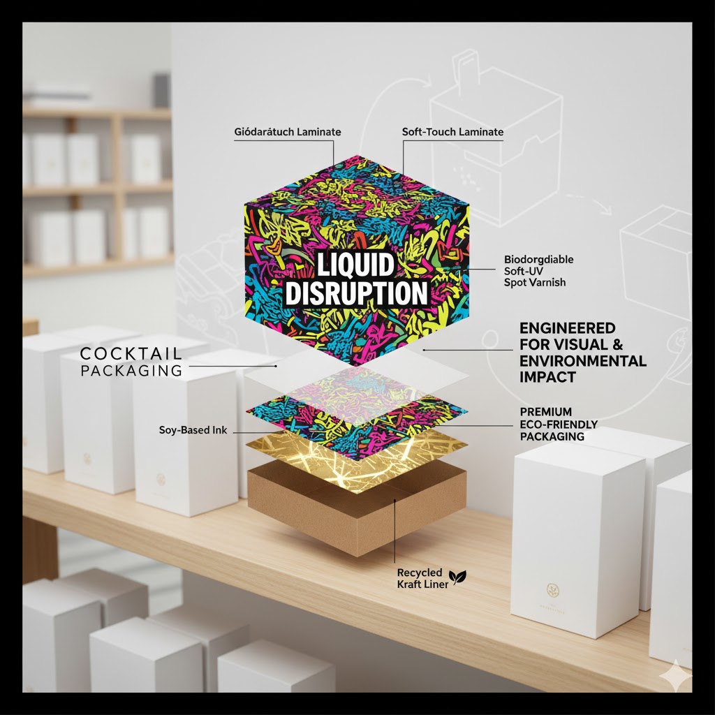
- Tactile Dissonance: Using a Cocktail Packaging soft-touch laminate next to a gritty, raised UV spot finish.
2. The Psychology of “The Double-Take”
Why does this work? The human brain is hardwired to ignore patterns it recognizes. When a consumer sees a standard tuck-top box, their brain categorizes it as “Package” and moves on.
When they see a Cocktail Packaging custom-engineered hexagonal box with holographic foil and clashing geometric patterns, the brain hits a “pattern interrupt.” This extra 2-3 seconds of attention is the difference between a sale and a skip. In the “Ready-to-Drink” (RTD) market, where shelf space is limited, this visual friction is your most powerful marketing tool.
3. Semantic SEO: Why “Experience” is the New “Product”
Google’s latest algorithms prioritize “Experience, Expertise, Authoritativeness, and Trustworthiness” (E-E-A-T). When you blog about packaging, you aren’t just selling cardboard; you are selling Consumer Retention.
Semantic Keywords to Watch in 2026:
- Sustainability-focused Maximalism
- Durable Beverage Carriers
- Custom Die-Cut Inserts
- Brand Storytelling through Print
By using Cocktail Packaging’s 3D Design Tool, brands can experiment with these “Chaos” elements without the risk of a physical misprint. You can visualize how a chaotic neon pattern wraps around a Mylar bag or a Luxury Rigid Box before a single drop of ink is spent.
4. Case Study: The RTD Cocktail Market
Let’s look at the beverage industry. A premium Old Fashioned mix shouldn’t just be in a box; it should be in a Cocktail Packaging masterpiece.
Imagine a box that uses “Chaos” design:
- The Outside: A riot of 1920s art deco patterns mixed with modern graffiti.
- The Texture: A mix of matte finish and “Rough-Touch” varnish.
- The Reveal: As the customer opens the auto-lock bottom box, the interior is a solid, deep “Midnight Navy” with a single gold-foiled QR code.
This transition from “Chaos” to “Sophistication” creates an emotional arc for the consumer. It makes the product feel like a discovery, not just a purchase.
5. Balancing Chaos with Brand Integrity
Can a brand be “Chaotic” and “Professional” at the same time? Absolutely. The secret is in the quality of the materials. Chaos design on cheap paper looks like an accident. Chaos design on premium 24pt cardstock with custom inserts from Cocktail Packaging looks like an intentional art piece.
How to execute Chaos professionally:
- Maintain One Constant: Keep your logo in a consistent, high-contrast spot (like a white PVC window or a bold black foil stamp).
- Use High-Fidelity Printing: Detailed chaos requires sharp lines. Our offset printing ensures that even the most complex patterns don’t “bleed” or look blurry.
- Focus on the Interior: Use the “Chaos” on the shipping mailer to build excitement, then use a clean, branded Rigid Box on the inside for the “Premium” payoff.
6. Sustainability in the Maximalist Era
A common misconception is that “Busy” packaging is bad for the environment. At Cocktail Packaging, we prove that wrong. You can have a loud, chaotic, and vibrant design using:
- Soy-based inks that offer incredible pigment without the toxins.
- Recycled Kraft liners that provide a “gritty” texture perfect for the Chaos aesthetic.
- Biodegradable laminates that still give you that “shimmer” effect.
7. Conclusion: Don’t Just Pack. Disrupt.
As we look toward the future of retail, the brands that win will be the ones brave enough to be “loud.” Cocktail Packaging is here to ensure that your “loud” design is backed by world-class engineering and premium materials.
The era of the “Boring Box” is over. It’s time to embrace the friction. It’s time to embrace the chaos.
Ready to start your design? Explore our Custom Box Gallery or use our 3D Design Tool to see your “Chaos” come to life today.